
updating...
Brand Experience
Museums Nacht‹CHF 1.– Grafik›
NeuEden
Space.3
Pristin
Life in Water, Ä
Peniel
Art Direction
L'Échappée BelleBlue Marble
100 Waves
Typography & Editorial
About PublishingBasler Zeitung
CMD+S
Thorn.otf
Shake Shack kr
Creative Coding
The New PhotoboothGraphic Design
New, New Basel StyleTime is SILVER
TBD(Throw, Break, Discord) More POSTERS +
About
©2024 Grace Hannah Park


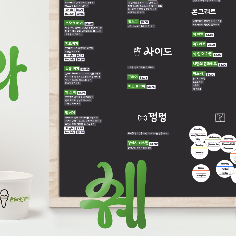
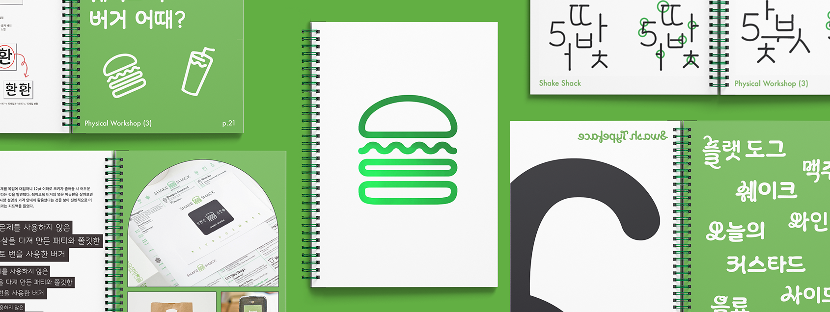
Global burger brand Shake Shack’s brand identity is designed by Pentagram. I found that well-made identity was not applicated in Korean branches because they couldn’t find any right typefaces to match with original BI design. This is a very common thing that happens when foreign brands reach out to the countries that uses different language. So I designed the Korean version of Galaxie Cassiopeia with 3 different weights.
글로벌 버거 프랜차이즈 쉐이크 쉑의 아이덴티티는 펜타그램에서 디자인하였다. 로고에는 깔끔한 Futura를 사용하지만 메뉴판을 비롯한 다양한 어플리케이션에는 Galaxie Cassiopeia를 사용하고 있는데 이를 호환할 한국어 폰트가 존재하지 않아 한국 매장 곳곳에서 브랜드 아이덴티티를 해치는 예시가 많이 보였다. 이를 통해 폰트가 브랜드 이미지에 미치는 영향에 대해 느끼고 이를 호환할 만한 영어 필기체 처럼 하나로 이어지는 듯 재미있는 한국어 폰트를 제작하였다.


Project Info
Details
Project Name
Type
Type
Korean Font for Shake Shack
Typography Design
Typography Design
Team Project
Duration
Duration
Hannah Park, JungEon Shin
03. 2021 ~ 06. 2021
03. 2021 ~ 06. 2021